Inkscape calendar layout
This year I made my own photo calendar, nicely printed on paper (is small sized, a calendar to put on your desk), the files are available as high-res PDFs, for download and use. Then the calendar sources were made available as SVGs, for anyone to use (both in Romanian and English), modify, play with and so on. Using Inkcape may look as a less optimal choice, a photographer would probably have used Photoshop for the task, a FOSS photographer GIMP, a designer Illustrator or Corel Draw, a FOSS designer Scribus, a newbie Microsoft Word, a FOSS newbie Libre Office... you got my point, there are a ton of tools to be used, some Free, some not. Still, my choice was Inkscape, since it is the tool I am comfortable the most for such task and here I will describe the process.
Of course, Inkscape is not the perfect tool for this, its lack of multipage support will make you use multiple files (12 files, one for each month and a cover, at least), self-made templates to keep the look consistent, will not automatically add crop and bleed marks (you can do it manually, but I didn't cover it here, maybe another time) and the resulting files will not be CMYK (if you need CMYK, which I didn't).
The calendar grid
Images or not, a calendar is defined by a grid of days, you can have a calendar with no pictures, but you can't have one with no days. So let's start with the most important part: creating a grid of days. I started with a square, you may start from a square too or use a rectangle, depending on the look you are aiming for, want the grid taller or wider. I made it colored to have the next step easier.
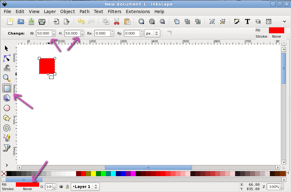
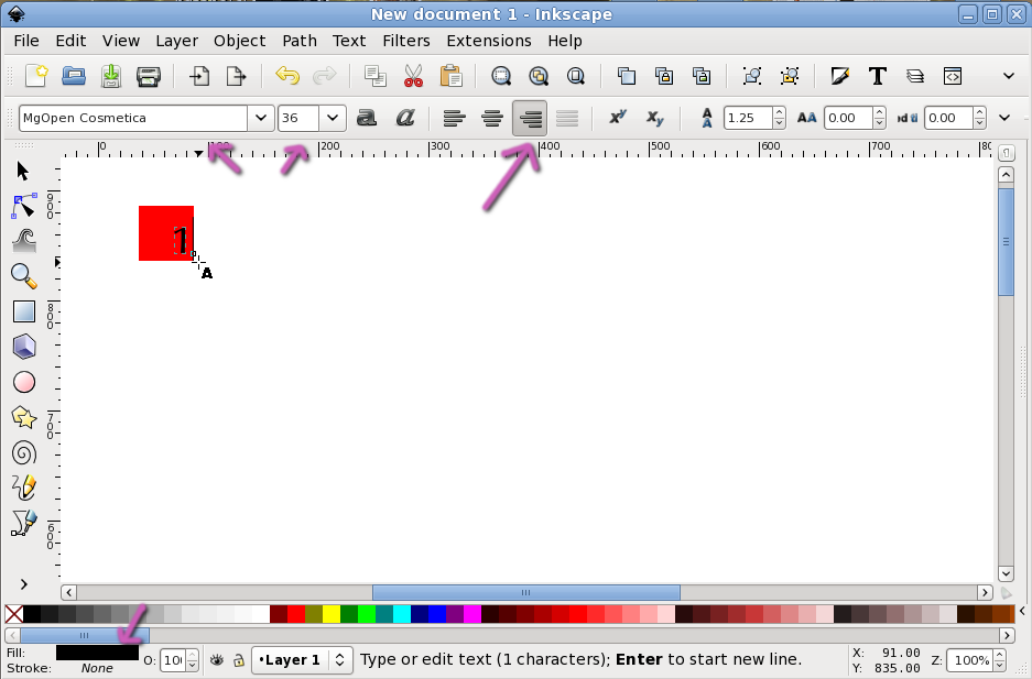
With the text tool write a digit (or a letter, whatever you want, a digit may be more useful since most of the text is goind to be numbers). This is the main text, so black is a sensible choice. Choose a font you like and a size that will look good (retrospectively, my choice it for a 36 pt font size was not the best, my final layout would have looked better with smaller letters, but bat taste is a right, correct?). Also, I made the text aligned to right, as that is the look I aimed for (depending on your intended look, it may fork aligned to left or center too). Place the text inside the rectangle whatever you want, only keep in mind its width will change, it should accustom both "1" and "30", so take care with spacing, size and alignment.
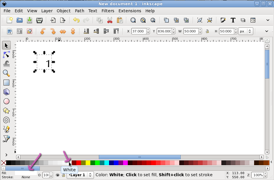
You can make now the rectangle white (or if you use a different background, make it that color). Or make it transparent, we don't need it visible any more but only as a spacer and placeholder.
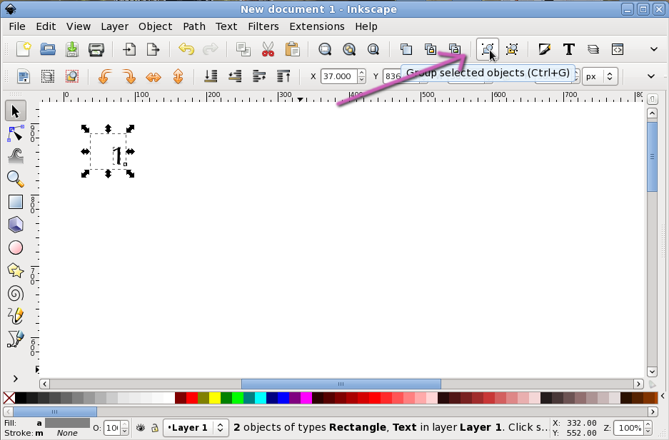
Select the rectangle and the text and group them.
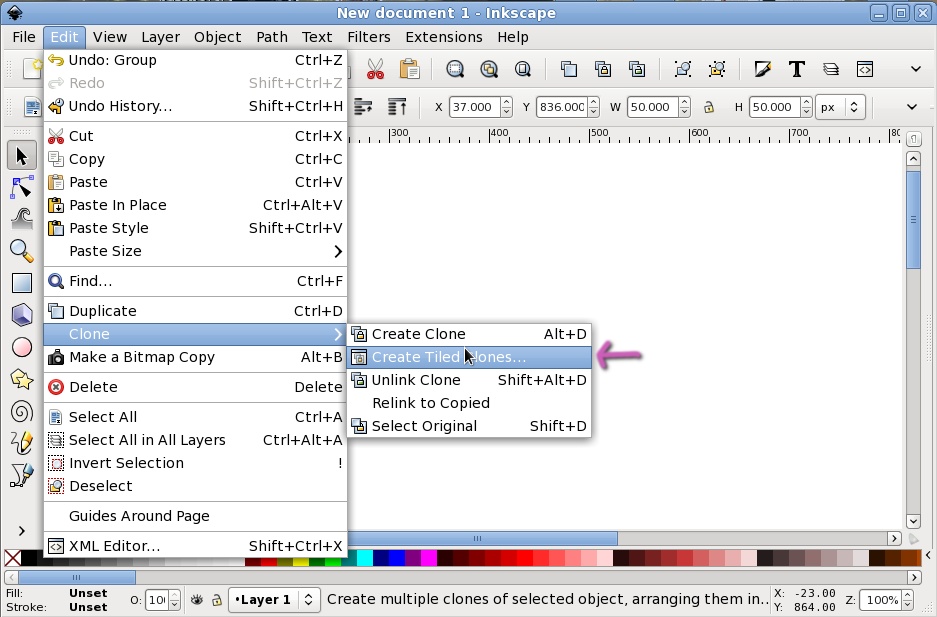
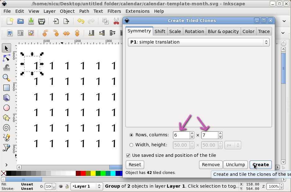
Select the group and make a bunch of tiled clones (Edit > Clone > Create Tiled Clones)
How many clones? Easy: a week has 7 days, sp we need 7 columns, a week is split in 4 weeks and some extra-days, so we need 5 rows for them plus another row for the day names, so 6 rows. Create the tiled clones. Make sure all the other parameters are zero, if needed reset them first.
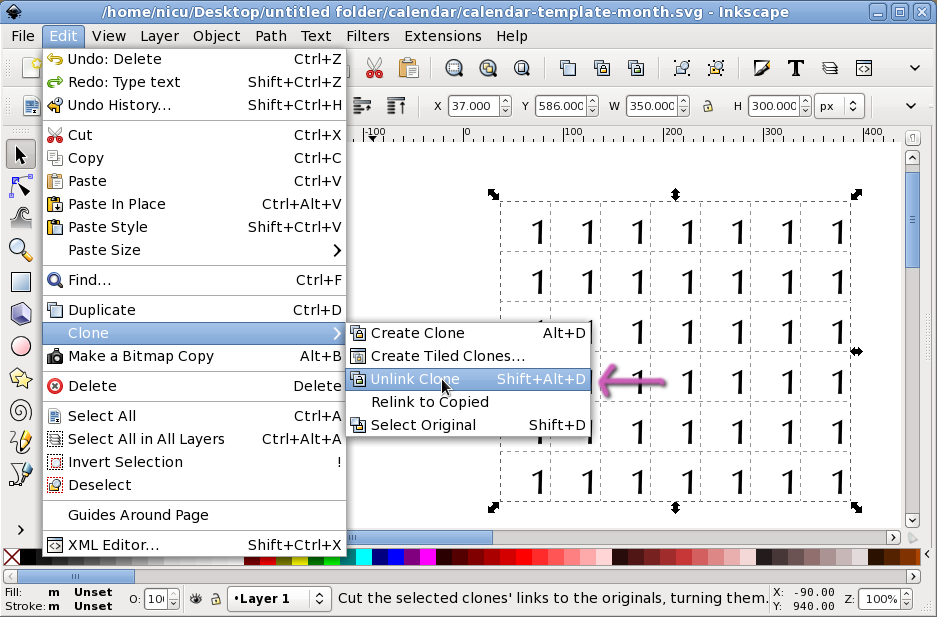
We have the basic grid layout, but we want to edit the values, the clones lived their purpose: select everything and unlink clones (Edit > Clone > Unlink Clone).
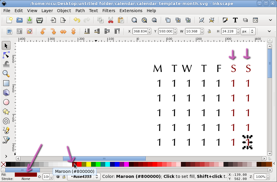
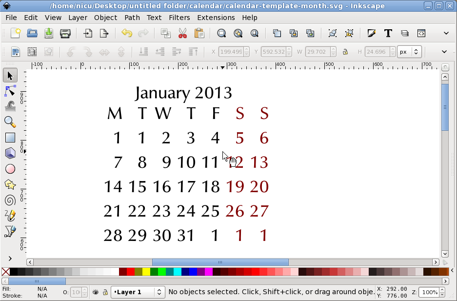
Take the text tool and change values of the first row to show the days names. I let here only the capital letter of the names, you may type the full name or an abreviation, just take care about the size, in that case you may need to use a smaller font size for the names. Nedless to say, in various cultures the calendars are represented differently: if you make an international one, is a safe bet to start the week with Monday and end it with Sunday, if is a USA one, start with Sunday and end with Saturday, if you make it for your own language, use the local day names and week convention.

If you want, you can emphasize the holidays making them a different color or maybe a different background. Or both color and background. Your calendar, your design, your choice.
Group everything.

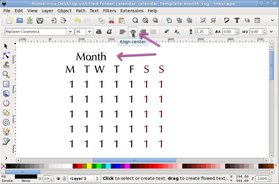
Back to the text tool, write a word to stand for the month name. It may be a good idea to keep consistency and use the same font face as the days names and numbers, but you can change the size, play with bold, italic or other effects... again, your design, your choices. Since the width of the month name will vary (from "May" to "November"), you need to plan your alignment: I want them aligned to the center, so I aligned to center.
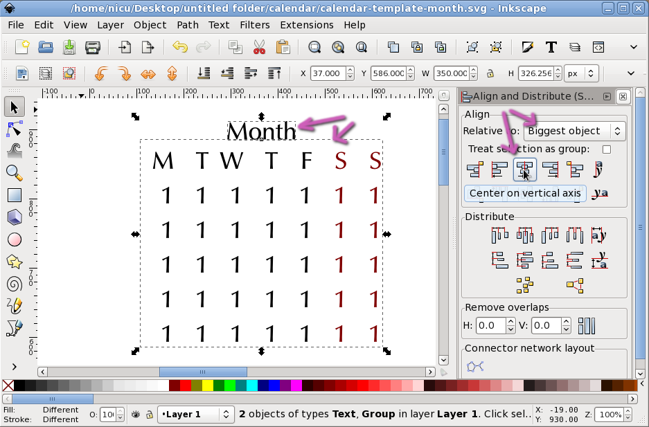
Select the month name, the days grid and use the Align and Distribute dialog (Object > Align and distribute). I aligned them to the center on the vertical axis of the biggest object. I can see designs with the title at the right or the left, it will have to fit the text alignment used in the previous step.
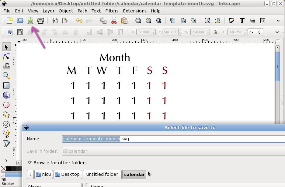
Good time to save as a template, from it you will make at least 12 derivations, each for every month.
A derivation is easy: replace the generic month title with an actual month title (it was my choice to add the year too), take a calendar (use the calendar widget on your computer?) to see the actual layout for the respective month and replace the placeholder digit with day numbers. I know no easy way of doing this automatically (short of writting your own program/script).
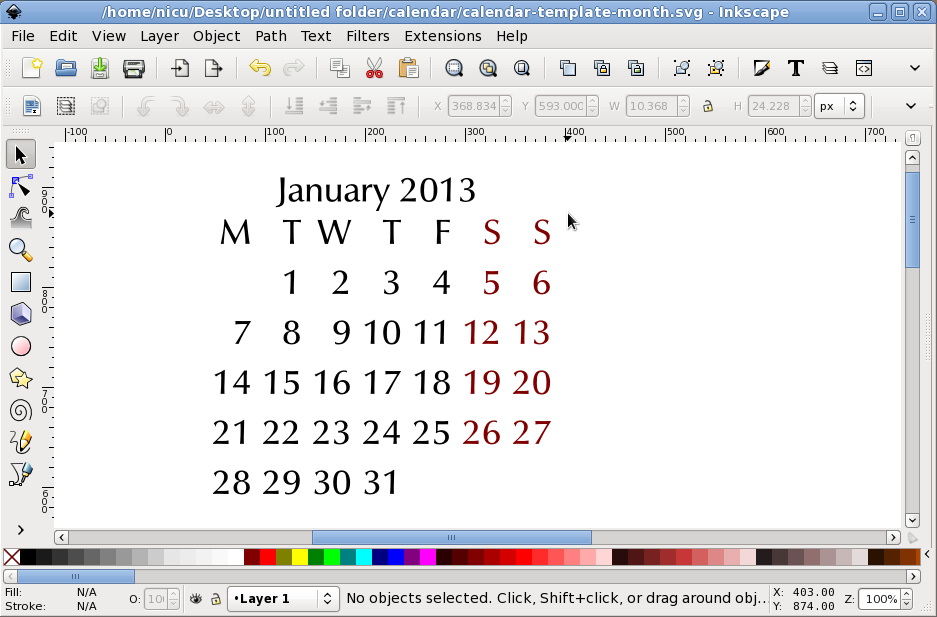
The unneeded placeholders can be just deleted. Now here's a trick: if a month spreads on more than 5 weeks, for example the first day is on a Sunday, then the last days, 30 and maybe 31 will be on Monday/Tuesday. You can reuse the first row for them, or move 1 on the last row, and keep a compact layout with 5 rows (see an illustration near the end of this tutorial).
Note: I don't like the layout very much, the font size was too big, but I am past the half of the tutorial, I won't go back and re-take all the screenshots with a smaller font size. I also don't want to confuse the readers with some "magic", editing the source file to decrease the font size in one single move. Write it off as bad taste on my side and use better spacing in your own layout.
The page layout
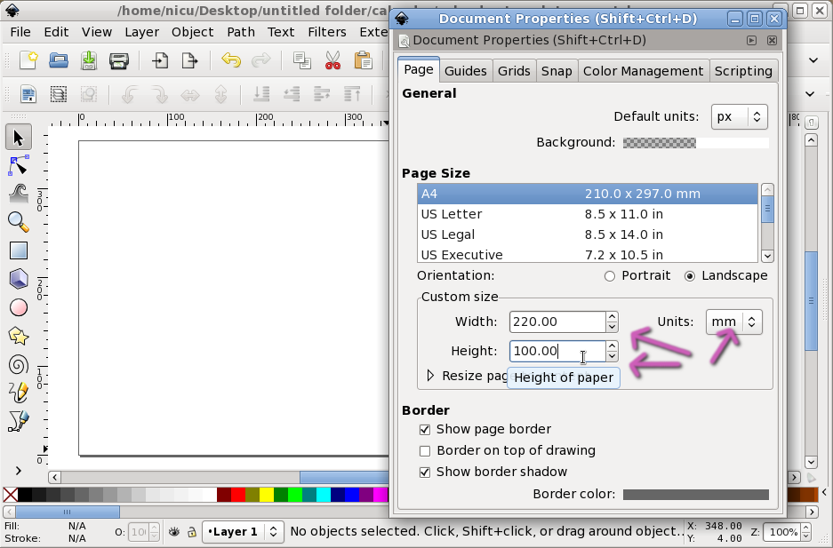
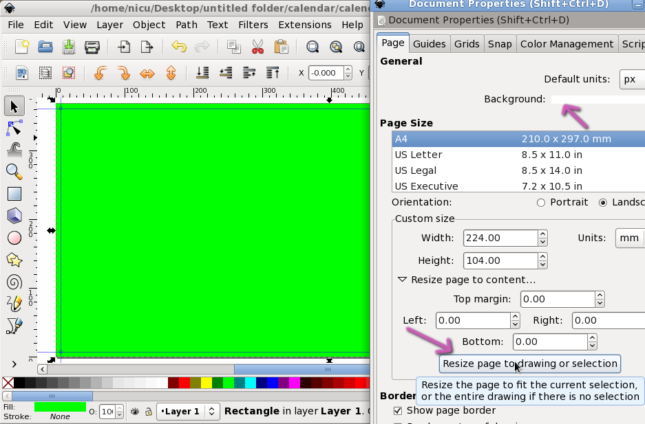
My calendar was printed, so I had to make it on the size required by the print shop, in my case 220 x 100 mm. Go to document properties (File > Document Properties), set the units to milimeters (or if you are USian to inches) and enter the values. Of course, you can work in pixels if a) the calendar is intended for on-screen use only or b) you make by hand the conversion (millimeters to inches and then to pixels, according with a DPI value).
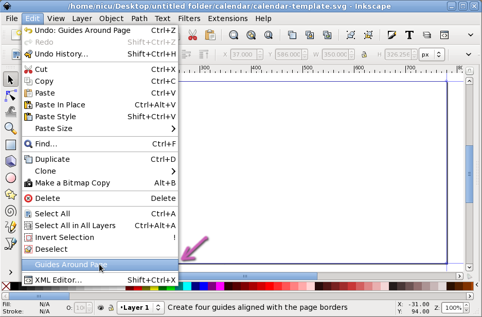
You probably know a printer can't go to the edge of the paper, you may need some margins or bleeds. Inkscape is not optimised for print, so here's a somewhat contrived way to make some: add guides around the page (Edit > Guides Around Page):
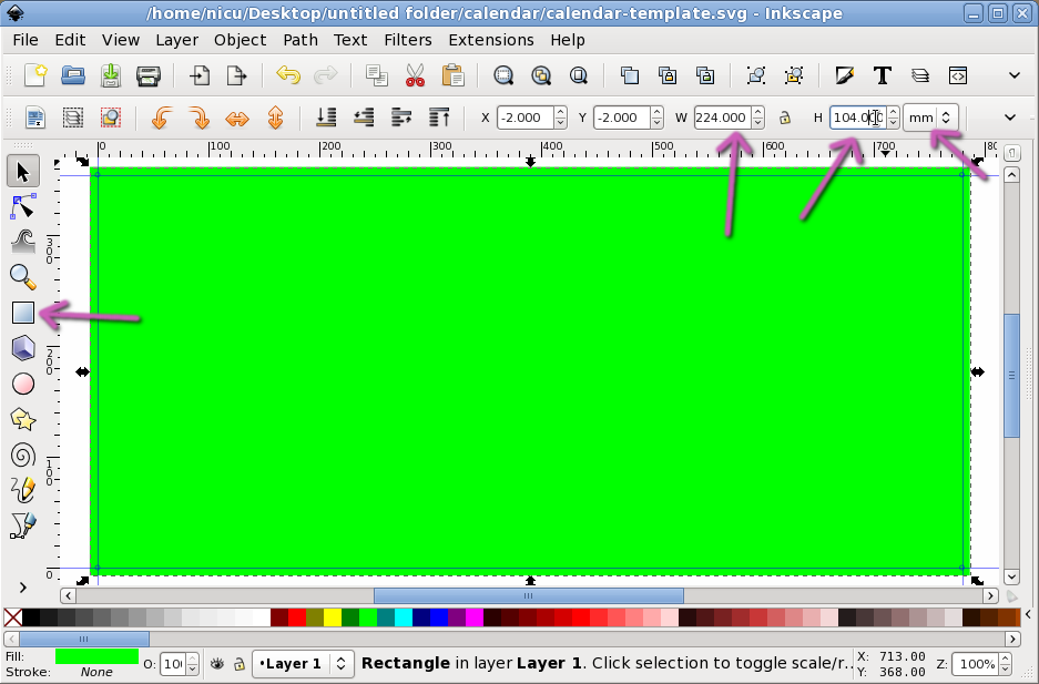
Create a rectangle with the size of your page plus the margins: in my case for a 220 x 100 mm with 2 mm margins on each side, it was 224 x 104 mm (you can set an object size in millimeters in the toolbar) and align it to the center (either with the above-mentioned align and distribute dialog, relative to the page, or manually, as I did above: X and Y coordinates at -2 mm)
Then back to the document properties dialog, resize page to drawing and your guides moved 2 mm inside the canvas. Make sure here your background color is set to solid white (or whatever color wou want as background) in case you will export as bitmap and/or want a solid background color. The big rectangle can be deleted now (or kept, if you want to play with background colors, for example a gradient - not wise for printing).
So we have here a simple page background. The rest is up to your "artistic" vision, for example initially I wanted my calendar in portrait orientation and very simplistic. But life is a series of compromise, the print shop was doing horizontal layouts, so I changed the layout to landscape, my partner and co-owner of the calendar wanted a more complex look, so we reached a middle ground.
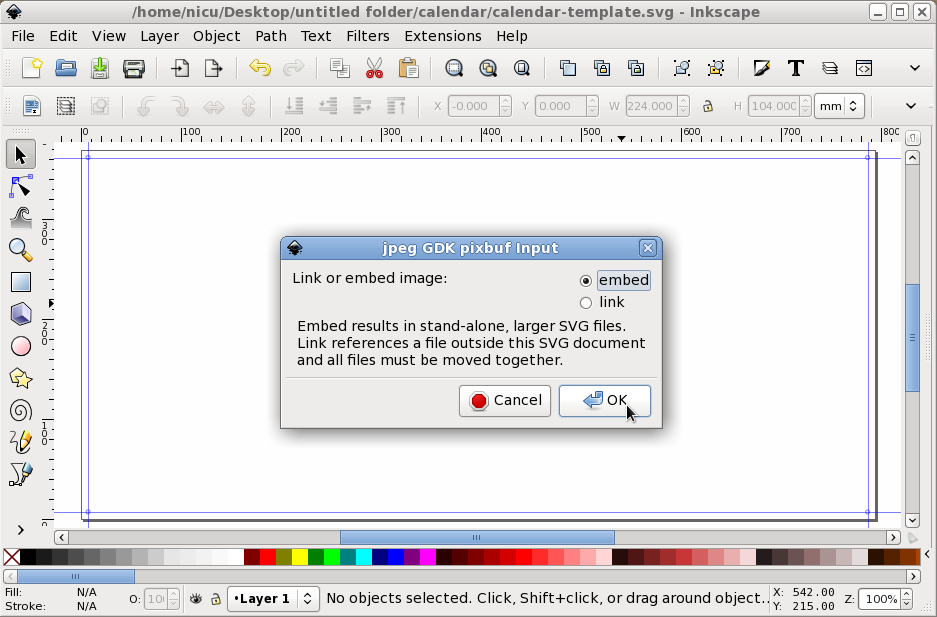
It is supposed to be a photo calendar, obviously you'll have to add a photo. Insert it. If you want to distribute the page as a single file, is a good idea to embed the image, not link it, the file size will increase a lot, but you have one file instead of two.
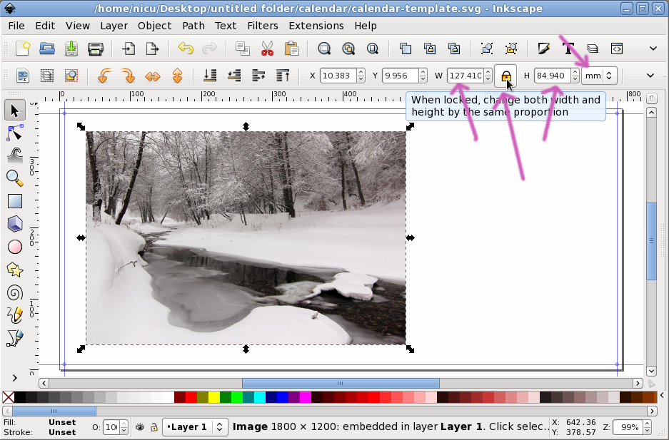
Use a large photo, more than you can see on-screen, if you go to print. Resize it to fit the layout. To preserve the aspect ratio, either keep the Ctrl key pressed while resizing, or toggle the aspect ratio lock. For display purpose, it may be a good idea to switch the measurement in pixels and make the image size an exact pixel multiplier, no decimals, no partial pixels, no interpolation.
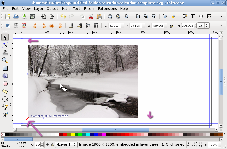
Add vertical and horizontal guides (by dragging them from the vertical and the horizontal ruler) and align the image to the guides, you want all the pages of the calendar have the same layout, on each of them the images will be aligned to the same guides. Of course, if you feel brave, you try and remember the image position in pixels, but is way easier with guides. Move your image so it is aligned to the quides and/or their intersection (is easier with an intersection, since it will set two coordinates at the same time).
Note: you can double-click on a guide handle, it will open a dialog where you can set it coordinates at whatever position you need.
In case your image wasn't resized at a perfectly predefined size, you can use guides on all its edges, for easier resize and placement.

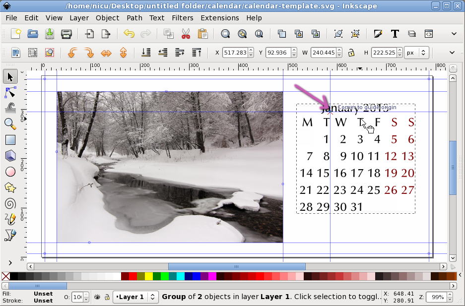
Remember the days grid we created back in the first section of this tutorial? Have you made grids for all the months? We need them now. Insert the days grid for your needed month. Add more guides and align it to the guides (all the rectangles used as placeholders for the grid can be used as anchor elements, so you have a lot of fine-tuning on your hands). If needed, resize the days grid, but either remember its size or use some more guides.
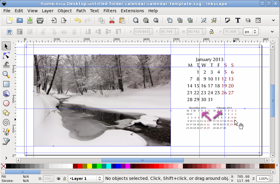
The "artistic" vision for this layour required a page to hold the calendar for the current month and small-size versions of the calendars for the previous and next week, so I had to import to more SVGs, one for each month, resize and align them (more guides needed, of course).
You have now the full layout for a calendar page. It will serve as a base for the other page, keep it, keep all the guides, just delete the various elements (image, days grids) and import new elements, positioning them according with the grids. Of course, is your design, so you can enrich it in any way you want: backgrounds, logos, titles, names, whatever.
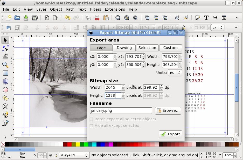
Print time! Since most print shops will look at you funny if you give them SVG files, some other may try to import them in various apps like Illustrator or Corel Draw, where you can't pe sure of the result, is a wise idea not to send SVGs (unfortunately). They may be happy with raster images, Inkscape will offer you export as PNG, which can be converted later with other tools in TIFF or JPEG. Make sure you use a print resolution, 300 DPI or more.
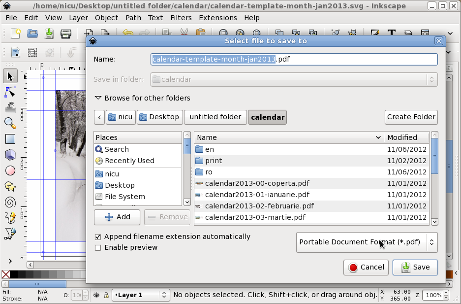
Or use "Save As" in Inkscape to produce PDF files, even if they are not print-optimized (like how you can make with Scribus), they are better than raster images. Convert text to paths in the export dialog, so you don't have problems with fonts availability on the priter side.
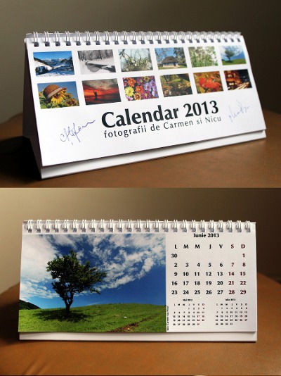
If you are curious, this is how my calendar, made following those steps, looks like: